
University Applicant Portal
Southern New Hampshire University Applicant Portal
̌
Southern New Hampshire University Applicant Portal
role
UX Lead
timeline
May — September 2019
type
Professional
Project overview
I spent four months working with Southern New Hampshire University (SNHU), to build out an applicant portal for both their online and on-campus student populations. Despite having nearly 87,000 online students across the globe and nearly 4,000 students on-campus, SNHU still relied on applicants enrolling for courses through a guided 30-minute phone call with an admissions counselor. While this degree of human-touch is undoubtedly what sets SNHU apart, they wanted to find a way to supplement these lengthy conversations through a self-service applicant portal that still provided applicants with the ability to speak to an admissions counselor whenever they needed.
Challenge
How could we create an applicant portal that streamlined the application process while still providing a personalized experience?
Phase 1: Understanding the Current State
Preliminary research
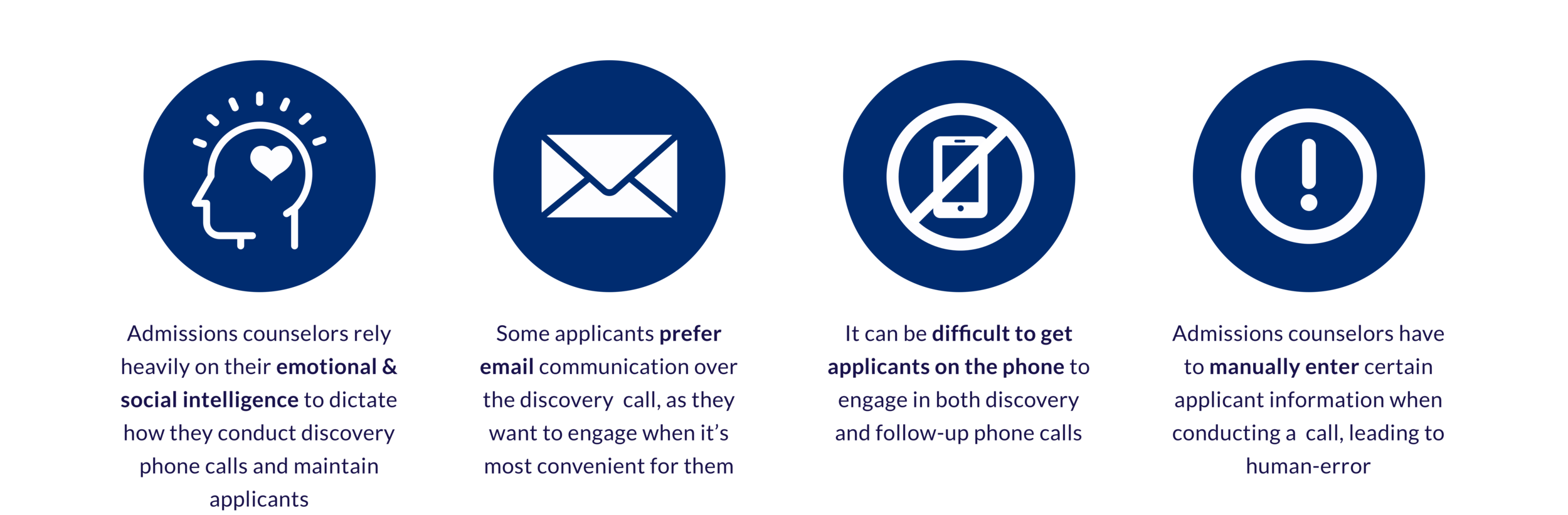
We conducted preliminary research with admissions counselors to gain a better understanding of the admissions process and their relationships with applicants. Our research included:
A 1-hour focus group with 6 admissions counselors from various departments
4, 30-minute 1:1 shadowing sessions with admissions counselors as they conducted discovery phone calls
Listening to and critically analyzing 5 previously conducted discovery phone calls
what we found
Phase 2: Client Workshop
SNHU was very concerned with the back-end migration from their current management system, so it was important that we align on designing with the applicant at front-of-mind. We conducted a two-day immersive workshop with SNHU and our internal functional team, guiding them through human-centered exercises like journey mapping, persona development, empathy mapping, and rapid prototyping.
Future State Journey Map
Created following our preliminary research and prior to the workshop, the future-state journey map outlined three potential entry points to the application process and the four main phases of the process: Inquiry, Application in Progress, Acceptance, and Enrollment. During the workshop, the journey map helped contextualize our areas of focus for the applicant portal, particularly “Application in Progress” and “Acceptance.”
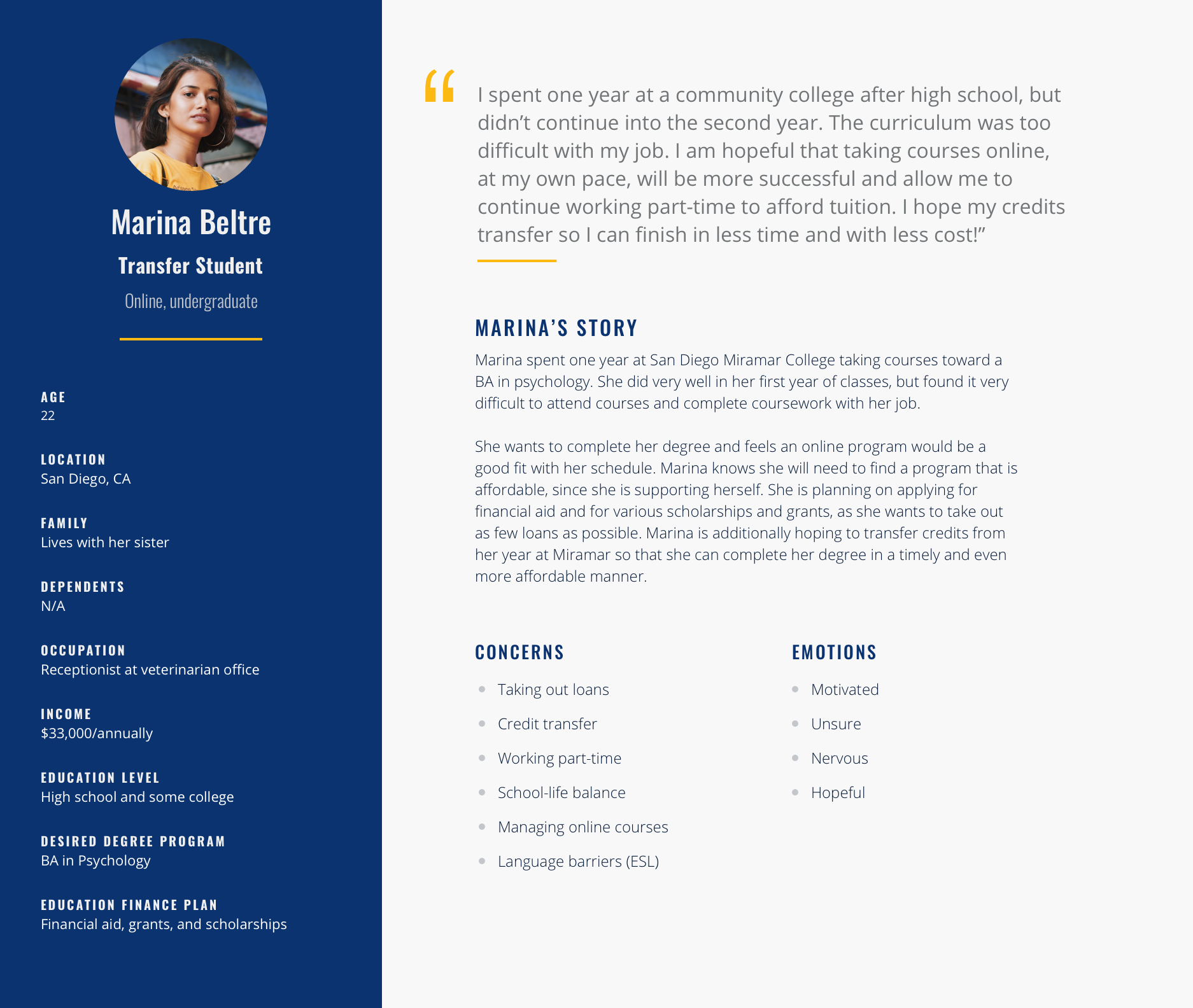
Personas
Leveraging insights from our preliminary research, I developed four main personas to guide our workshop exercises. The personas spanned SNHU’s key student segments between the online and on-campus populations: Recent high school graduates, military members, working professionals, and transfer students. During the workshop, we split the client up into four groups, each responsible for empathy mapping and rapid prototyping with their persona in mind.
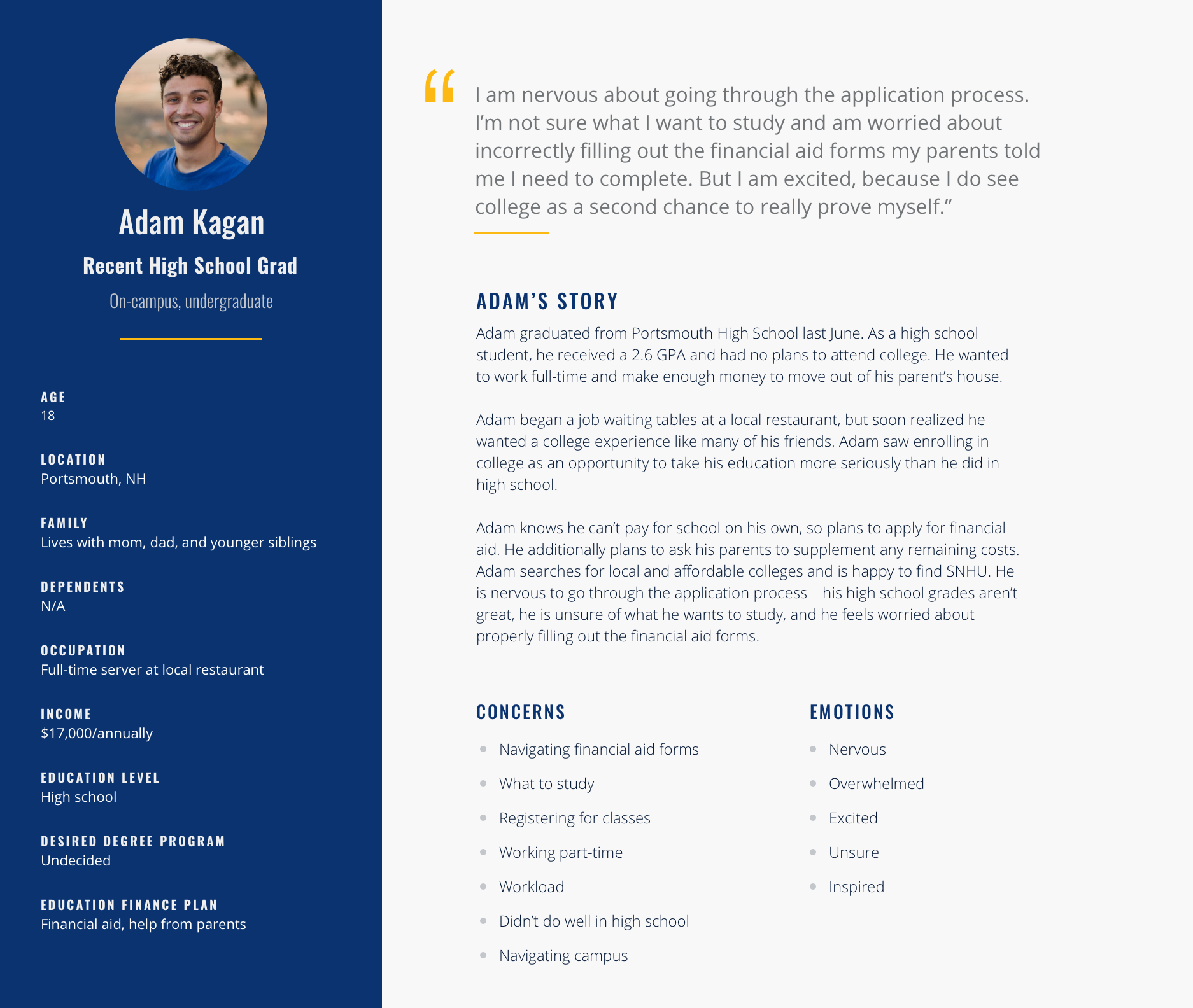
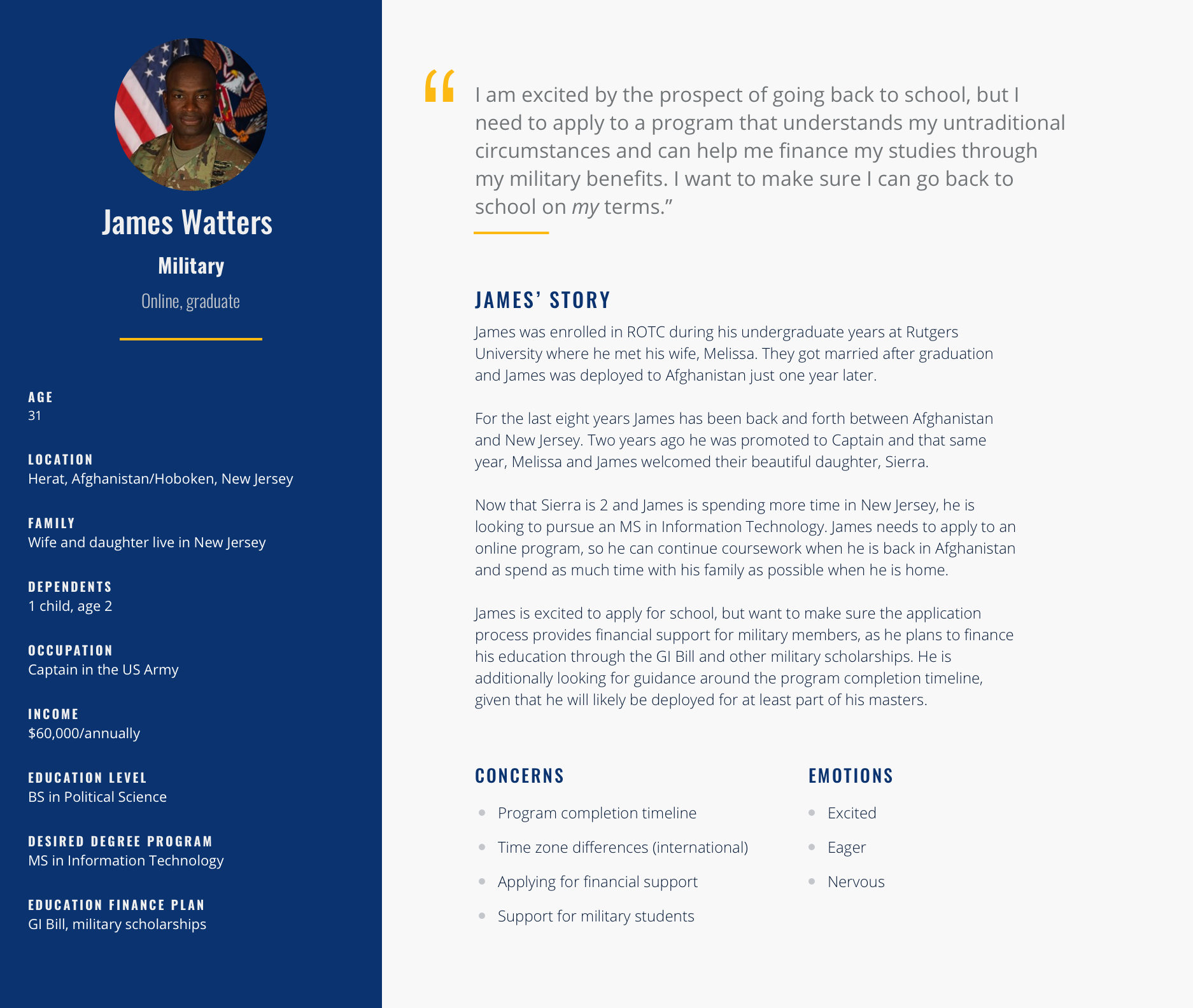
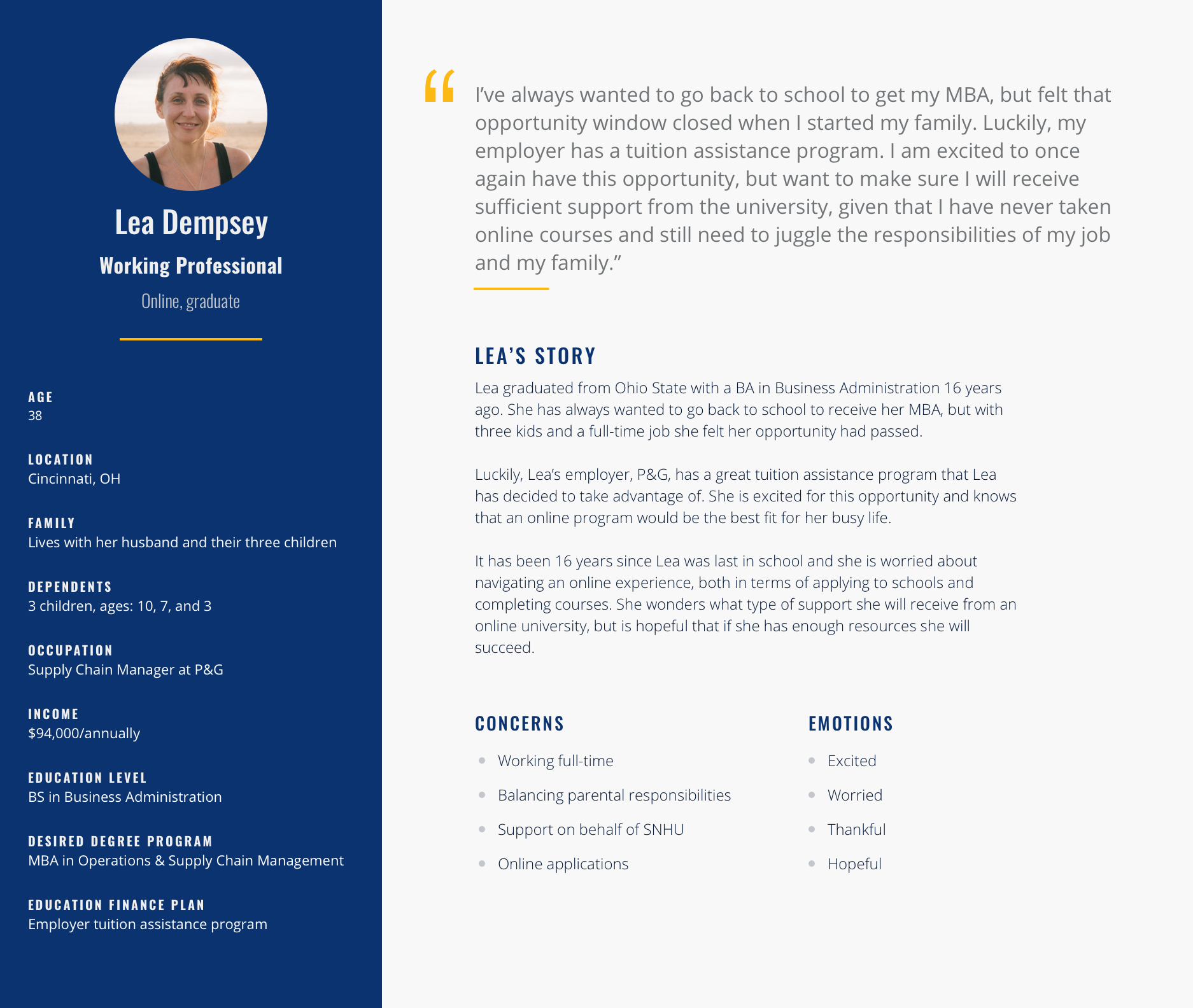
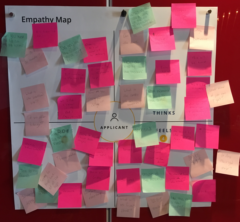
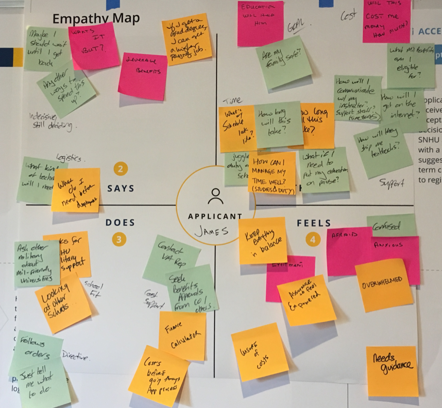
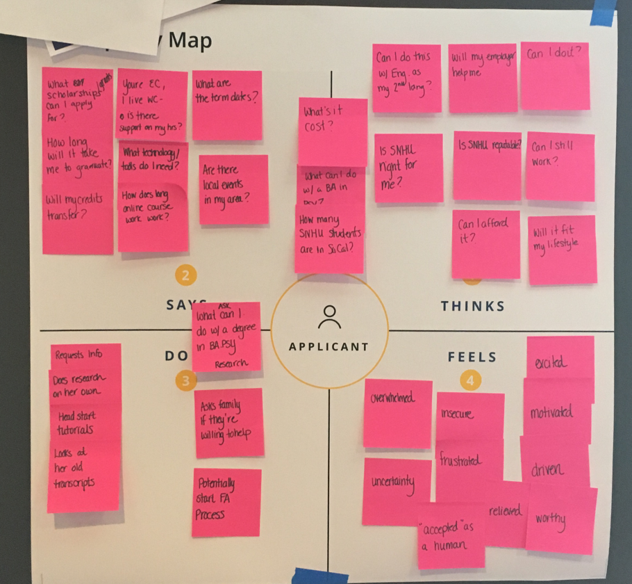
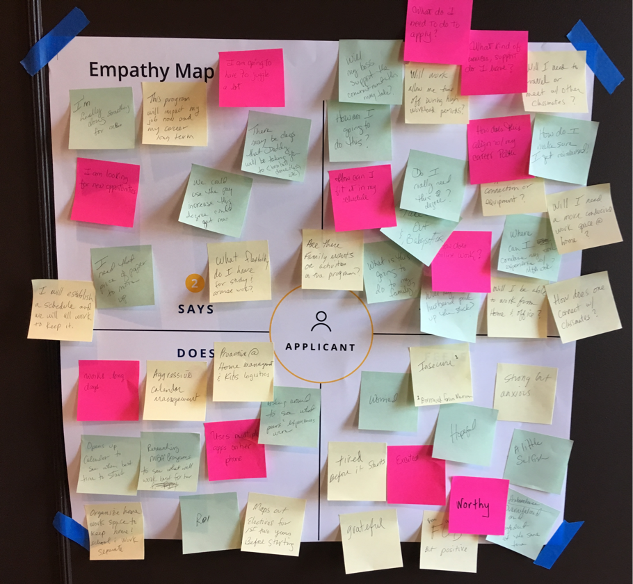
Empathy Mapping
The empathy mapping exercise was conducted using the respective persona each group was assigned. We asked each group to take a walk in their persona’s shoes, capturing what he/she might say, think, do and feel in regard to applying to university.
Rapid Prototyping + feature-set prioritization
Following empathy mapping, we had each group rapidly prototype two main pages in the applicant’s portal: The dashboard and action items. We then asked each group to share some notable elements from each of their designs and why they found them to be important. We digitized these sketches overnight and discussed them as a whole group during the second day of the workshop, prioritizing feature sets for the MVP launch.
Phase 3: Creating the User Experience
Working in two-week design sprints, I spent the next 8 weeks wireframing the main flows from a mobile-first approach, reviewing the designs weekly with SNHU and iterating as needed.
I worked with an offshore designer in India, who helped with the FAQ screens and with implementing small changes. I additionally designed with AA ADA compliance in mind, holding weekly design reviews with a client-appointed accessibility team to ensure that the wireframe designs were capturing and anticipating the appropriate design elements.
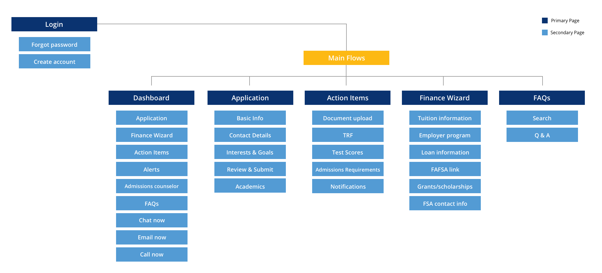
Site map for the applicant portal
Application Wireframes
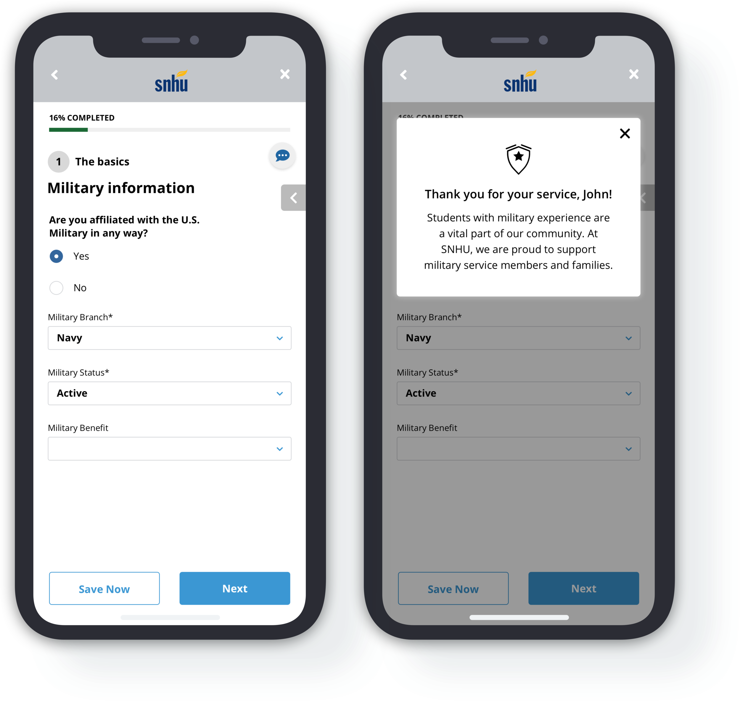
Given the amount of human-touch in the counselor-guided application process, we knew the process we designed had to be more than just a multi-step form. To bring that personalized experience I designed a number of unique elements for this flow:
Onboarding Screens
A shorts series of screens that relay what the applicant can expect from the application process.
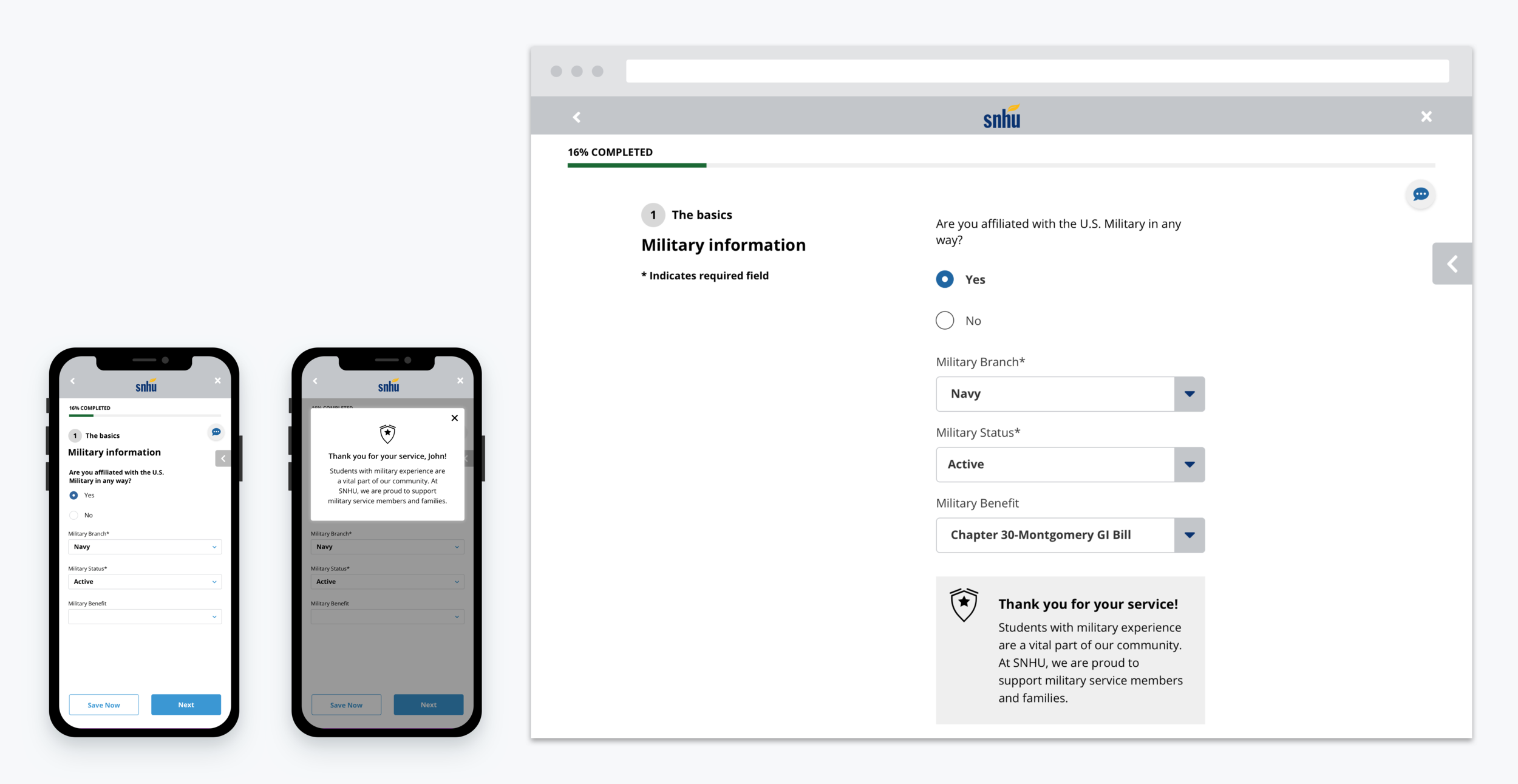
Dynamic, Personalized Messaging
Appears to the applicant when certain information is entered to help reinforce a sense of personalization and human-touch.
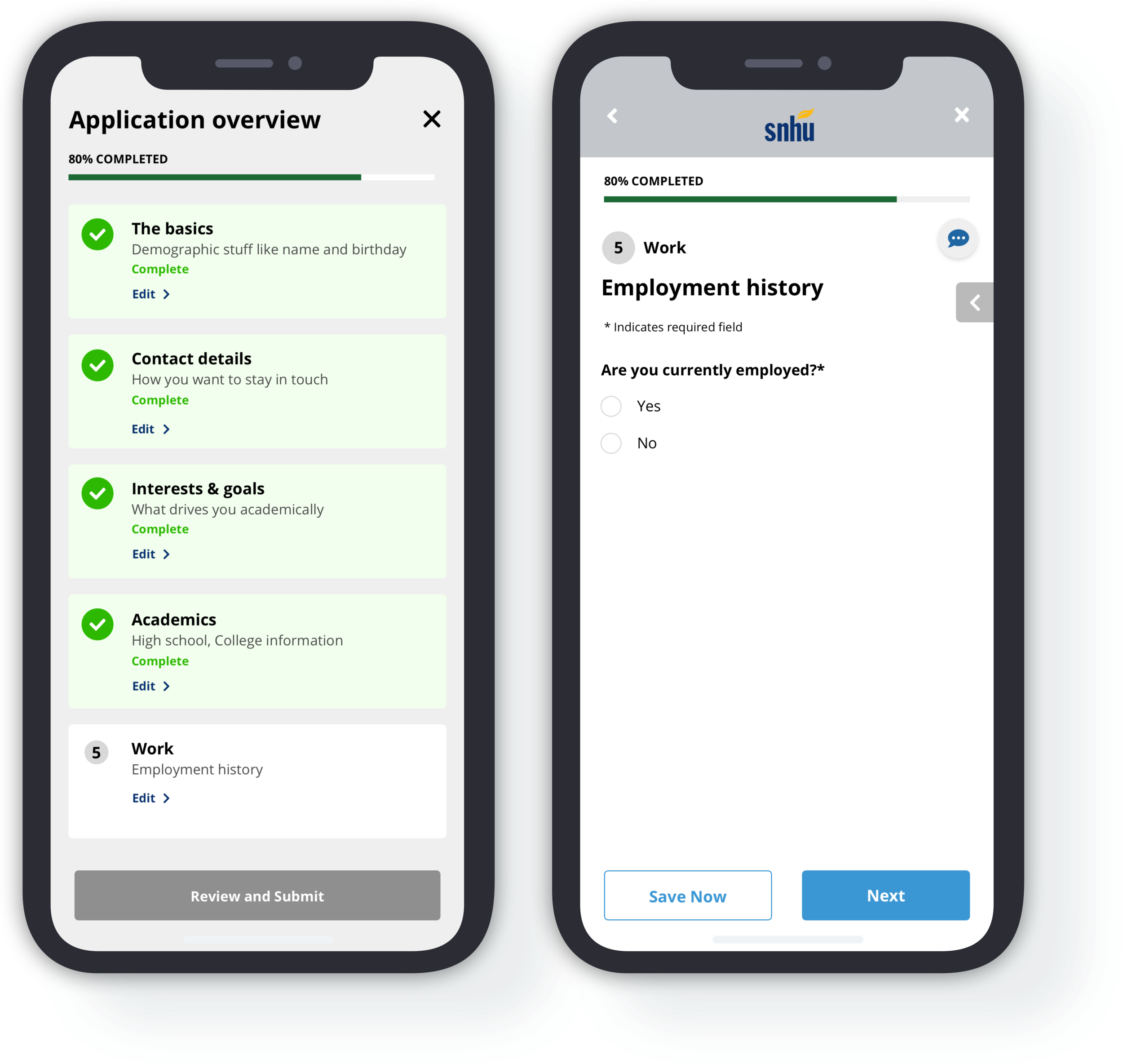
Progress Bar + Status Indicators
Progress and the application overview are visible and accessible to the applicant from each page in the application flow to provide the them with both transparency and the freedom to move through the application in any desired order.
Break pages
These pages occur between each completed section to encourage the applicant’s progress through the application.
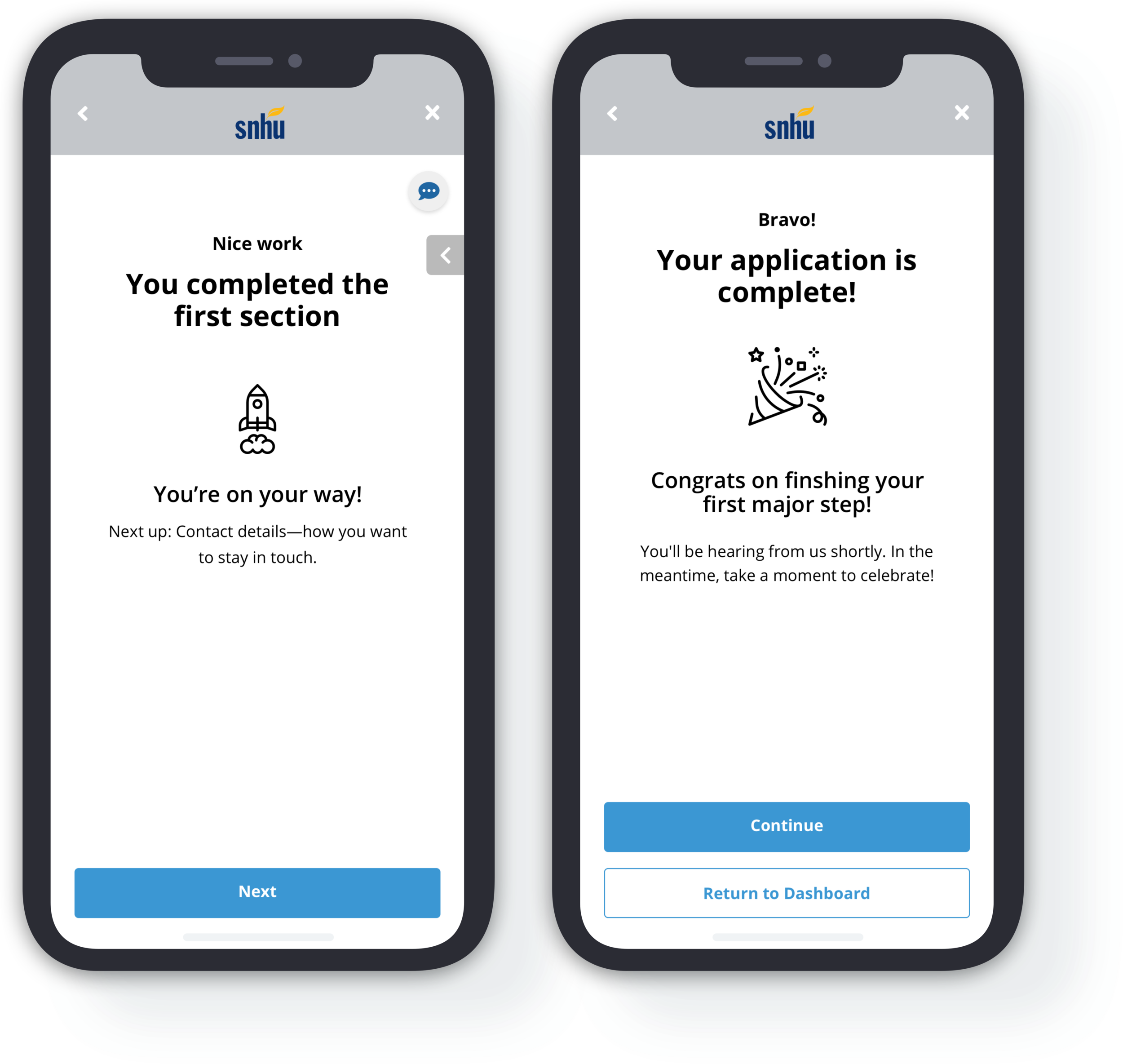
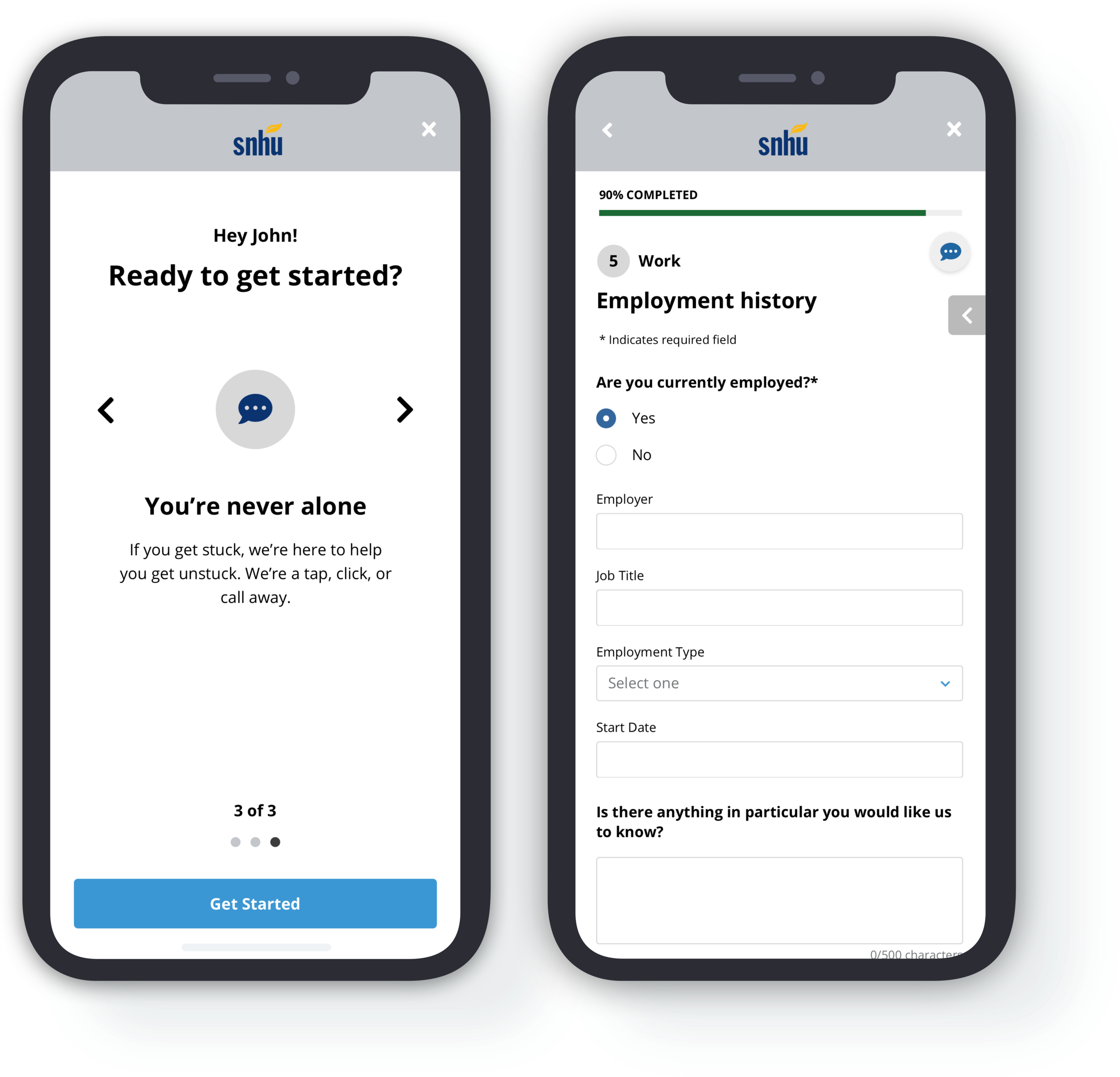
Chat
Chat elements exist on each page so that the applicant always has a point of contact if they have questions.
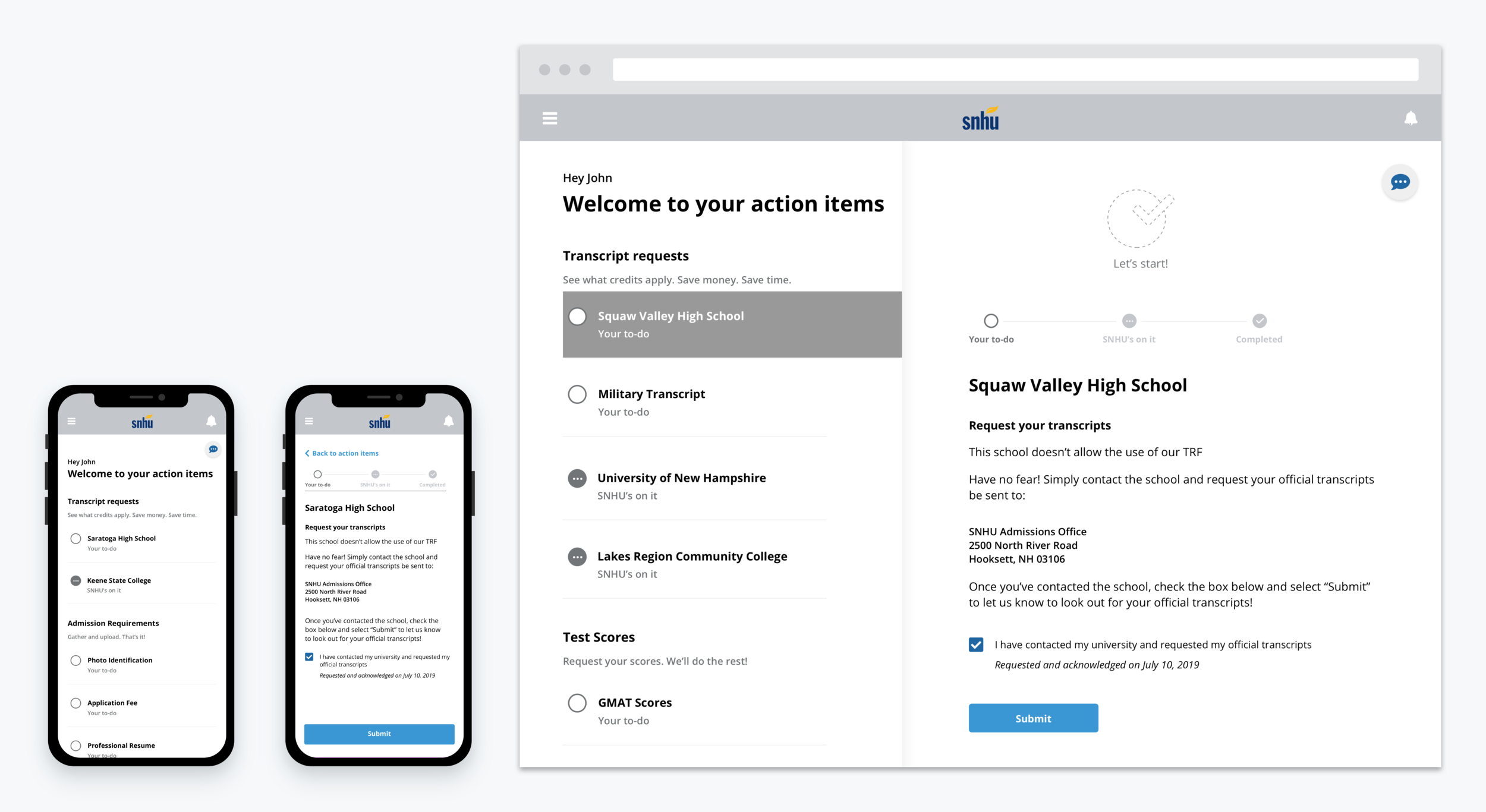
Action Item Wireframes
The action items flow is essentially a list of “to-do’s” the applicant must complete in order to receive their acceptance. It was important to SNHU that this flow not feel task intensive, as this is what typically leads to drop-off in their current admissions process. To provide a personalized, streamlined experience, I made the following design decisions:
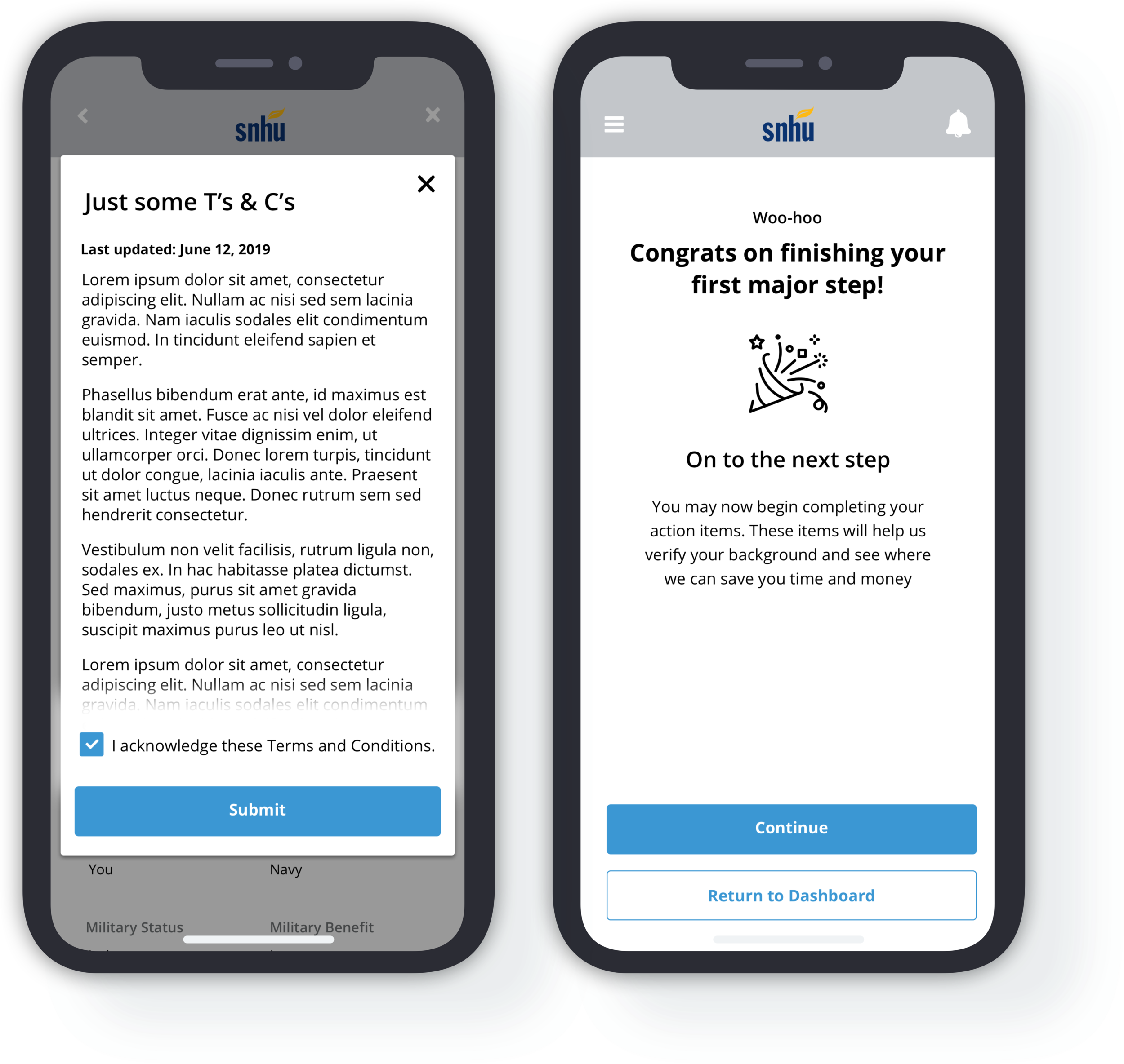
Congratulatory Messaging
Messaging that immediately follows the completion of the application to encourage the applicant to continue to their action items, but also provide them the option to return at a later time.
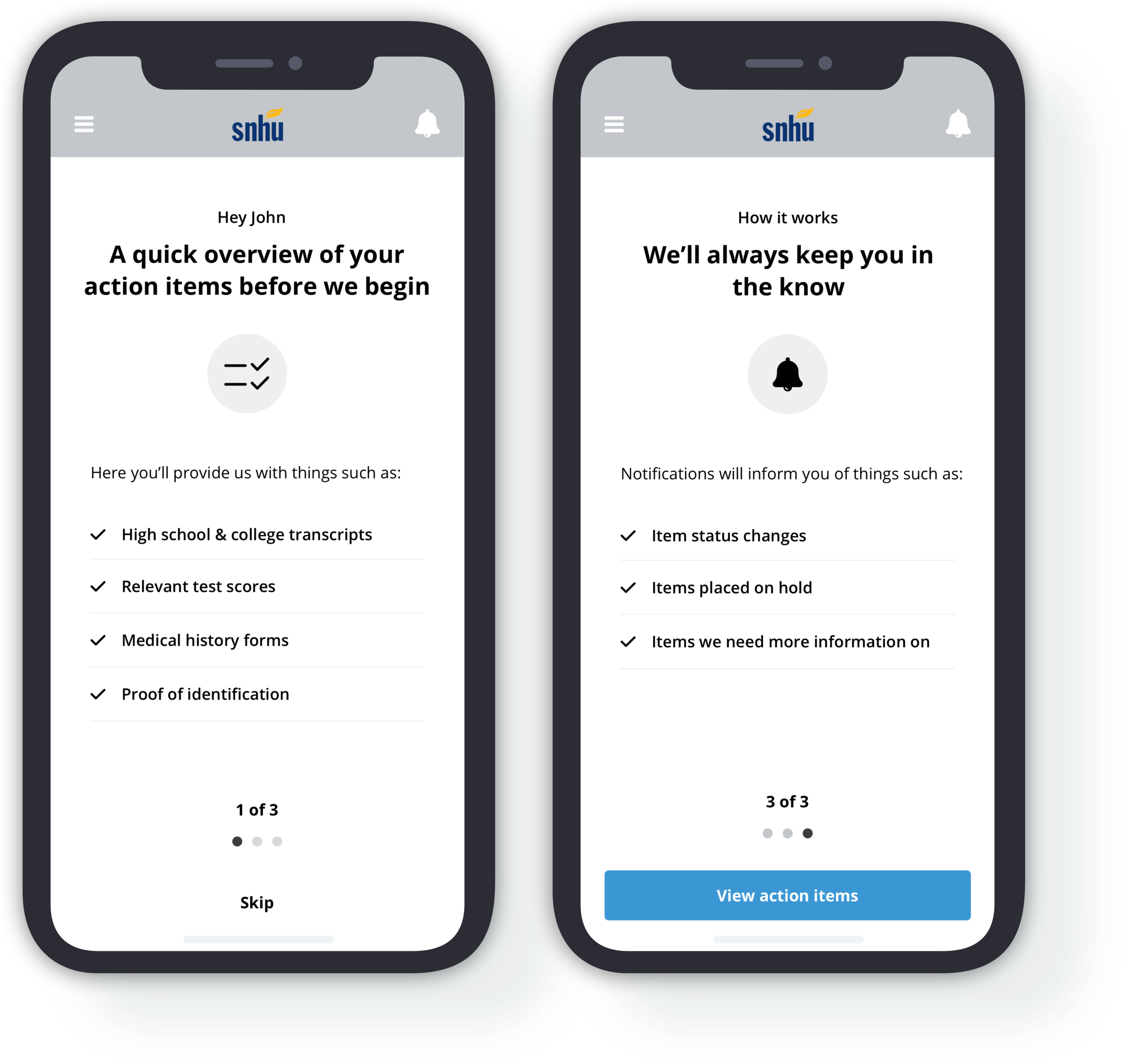
Onboarding screens
Similar to those that preceded the application flow, these screens provide transparency around what this section will entail for the applicant.
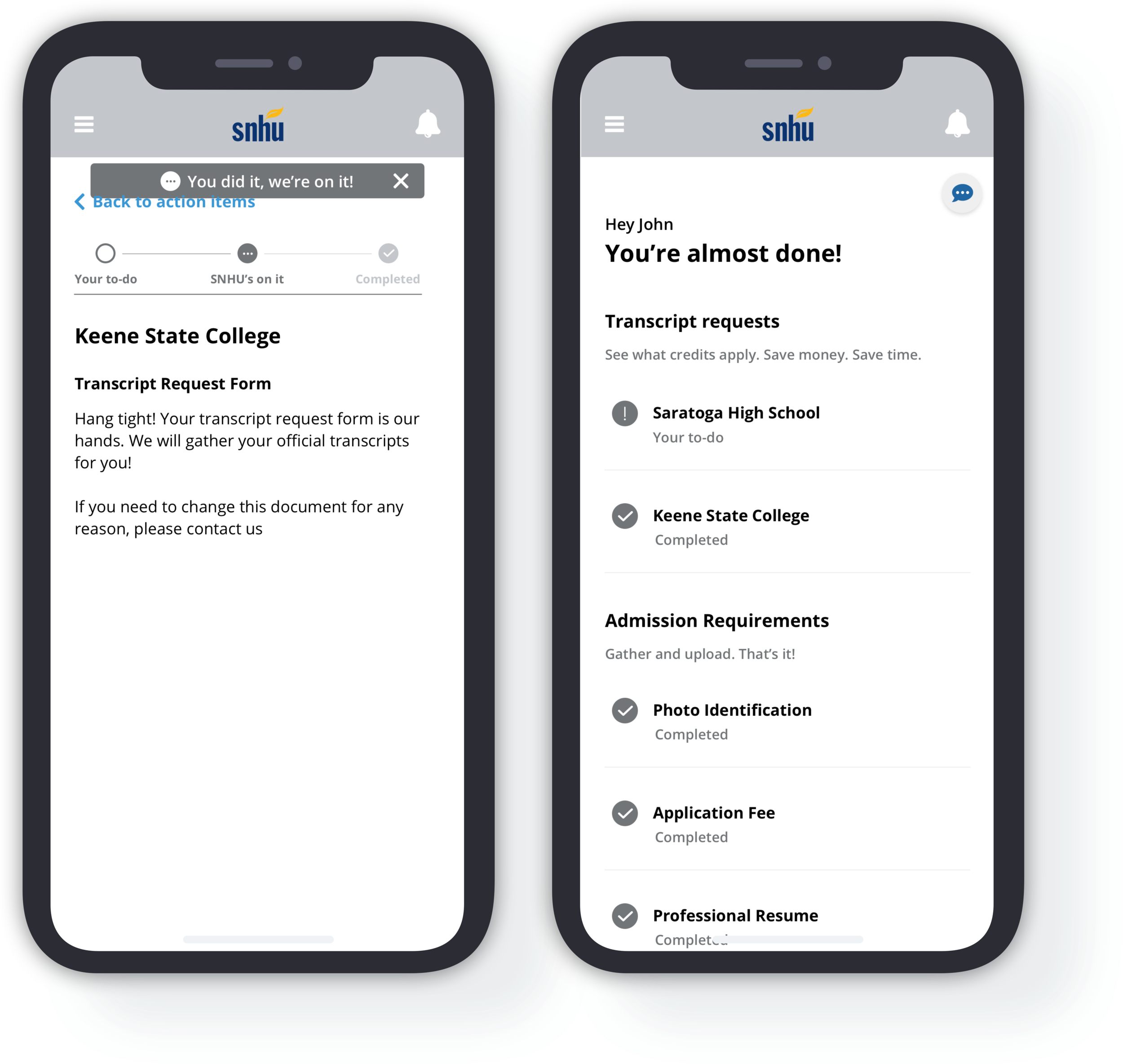
Sense of Progress
Item statuses enable a sense of progress and provide operational transparency by making clear to an applicant that once they’ve completed a task, SNHU will handle the rest.
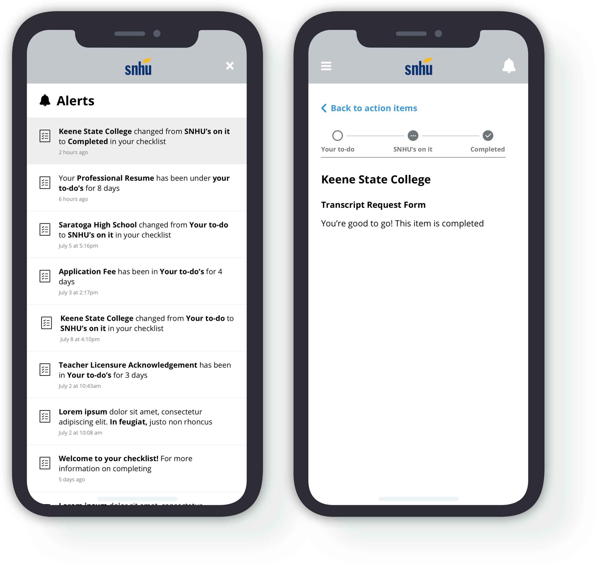
status changes
Alerts indicate any item status changes or additional information needed from the applicant. Changes are additionally reflected within the applicants’ action items by change in status icon.
Dashboard Wireframes
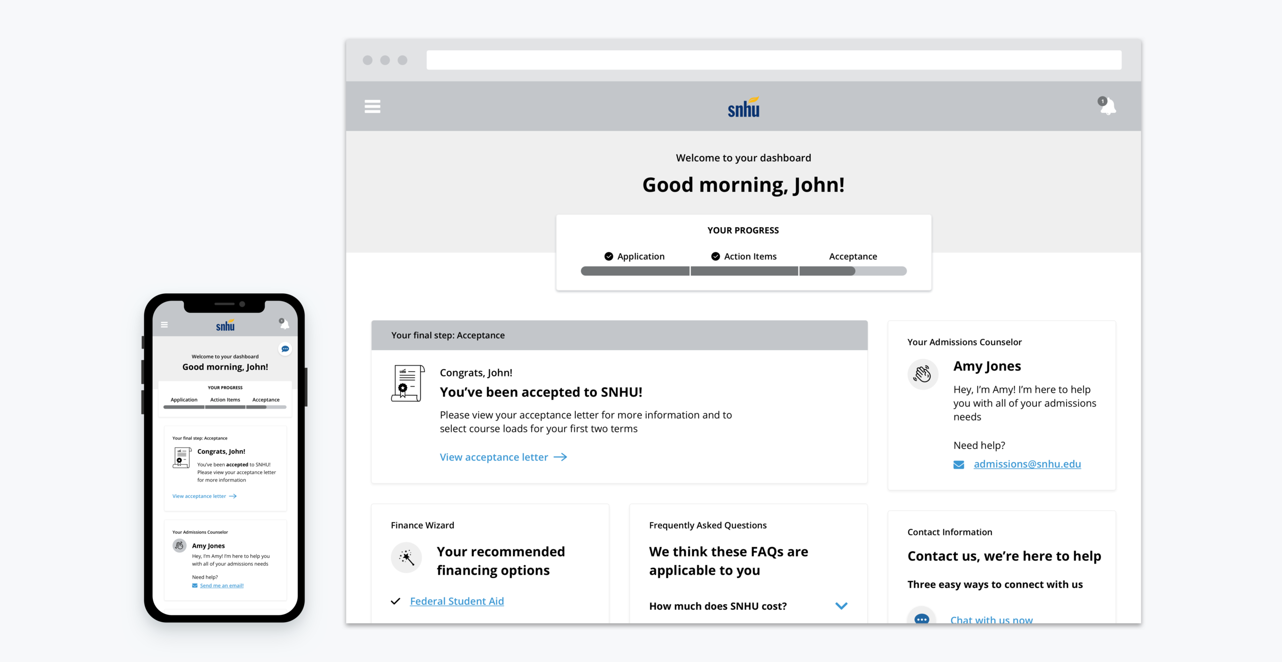
The dashboard screens had to set the context for the entire application process. Personalized, friendly, and transparent components were imperative to these pages. I designed the dashboard to be state-based, updating the messaging and components based on the applicant’s progress across the three required stages. I made the following design decisions:
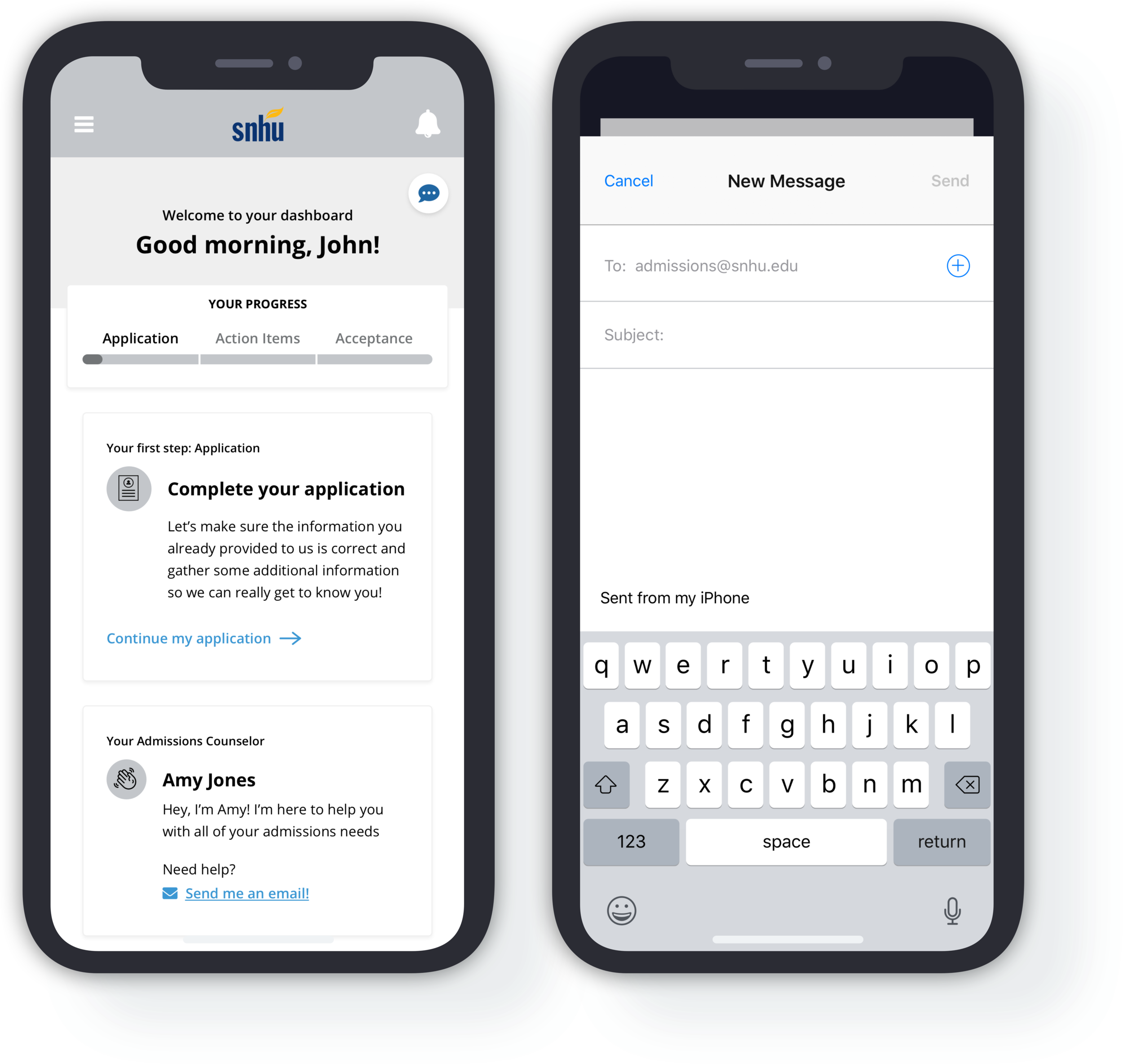
admissions counselor information
An admissions counselor component placed immediately underneath the primary action component, which provided a friendly message and contact options so the applicant knows their assistance options.
Congratulatory Messaging
Encouraging, congratulatory messaging to outline the student’s next steps and encourage them to share their successes.
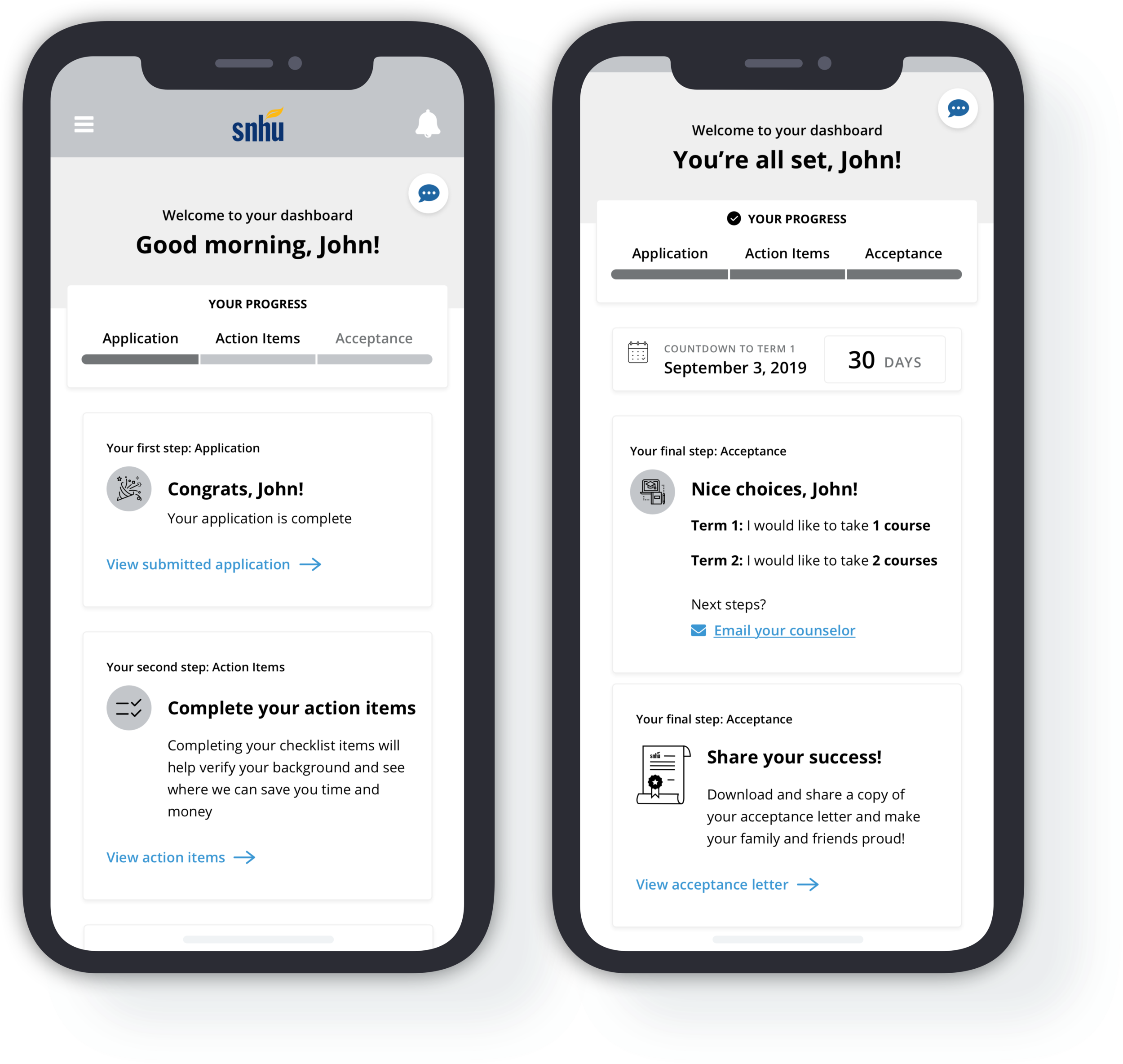
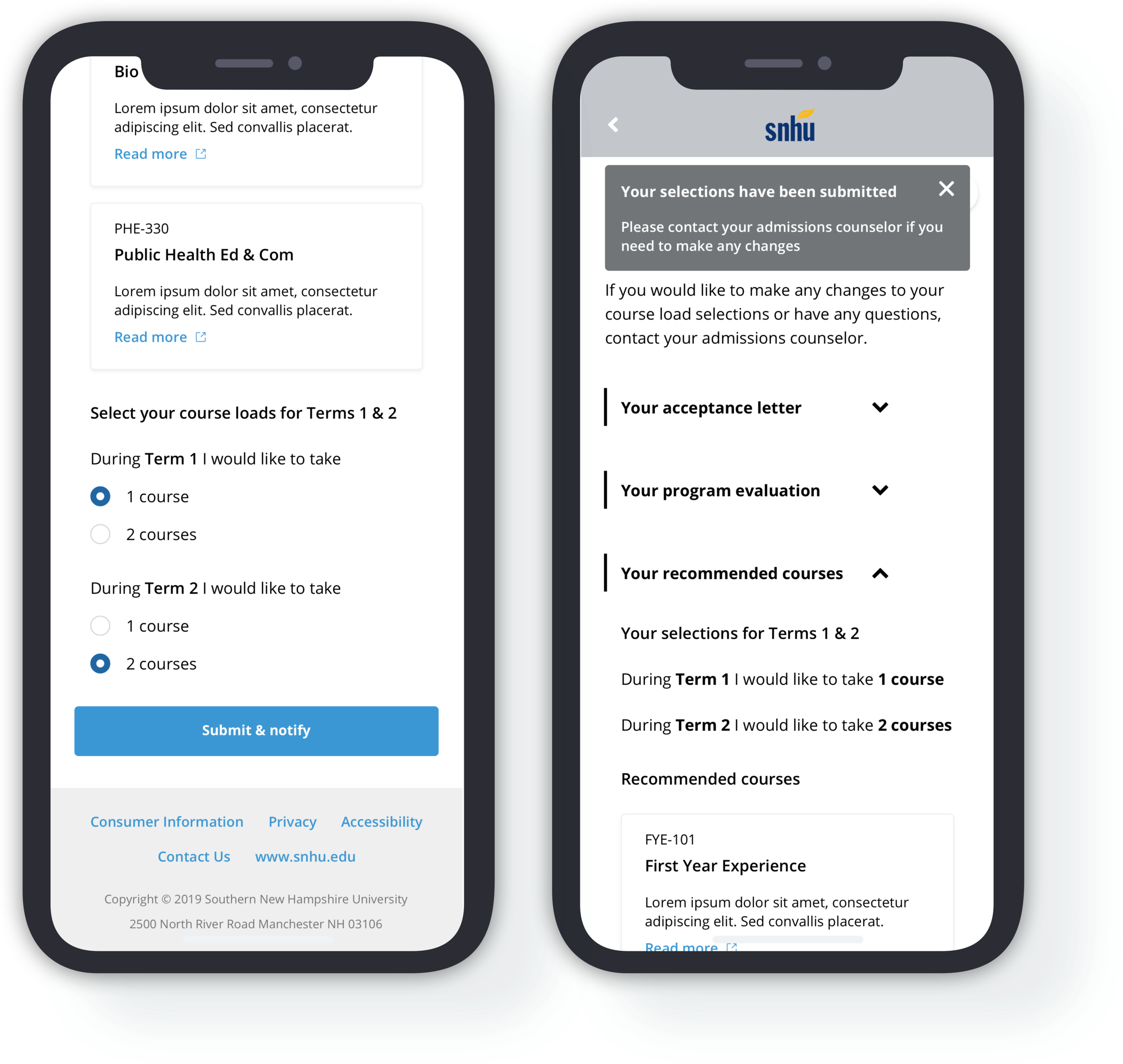
Control of their Education
The ability for students to select the number of courses they feel comfortable taking during their first two terms, in order to provide a sense of control and to help alleviate the anxieties associated with going to school.
Designing Responsively
Transition to Visual Designs
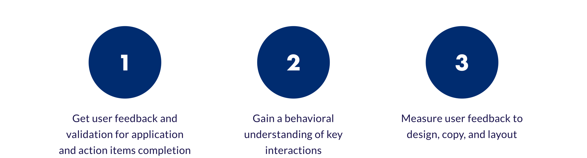
Phase 4: Usability Testing
Prior to the MVP launch, we conducted a round of usability testing to validate and inform the mobile and desktop versions of the applicant portal. The key objectives were to:
HIGH-LEVEL insights
100% of users reported understanding the content, thought the design and layout were easy to use, and found it easy to understand what they needed to accomplish
There was no significant difference between mobile and desktop usability
Overall usage of the application was fluent and natural
““The step by step guided application was very helpful because there was nothing that I skipped, I went in a sequential order…I knew that I needed to pay the application fee, and then it checked off when I ‘did’. Having a systematic order helps the student feel more organized and prepared.” ”
Phase 5: MVP Launch + Initial Rollout
During the first MVP release in December 2019, 12 prospective students were invited to use the applicant portal. 75% of these students successfully submitted the application and 2 have already been accepted to SNHU. On average, these students completed the entire application process in less than 2 hours—a huge improvement from the previous process, which took approximately 2 days and multiple phone calls between the admission counselor and the student to complete.
At the end of January 2020, SNHU rolled out the new application portal to 15% of their prospective undergraduate population. For a sample size of about 1,000 prospective students, the percentage of students who submitted their application was 65% higher than those students who were still going through the traditional application process—a great step forward in SNHU’s goal to enroll 300,000 students by 2023.
Reflection
I was eager to design something within higher-education and found my experience on this project to be full of learning opportunities. With so many vocal stakeholders on the client side and numerous internal teams to accommodate, this project tested not only my design skills, but my ability to manage different voices with unique asks.


